Artisticparrot Branding (2022)
Creation of multi-platform visual brand identity for personal ceramics business using traditional illustration and Adobe Illustrator
context
personal
role
graphic design, illustration, art direction

outcome
In this project, I aimed to create a unique and cohesive brand identity for my personal ceramics business that aligned with my ceramic work, and values as an artist. I designed an art direction strategy distinct to my business and applied it across contexts to web identity and print assets included with purchases to create a consistent brand experience.

process
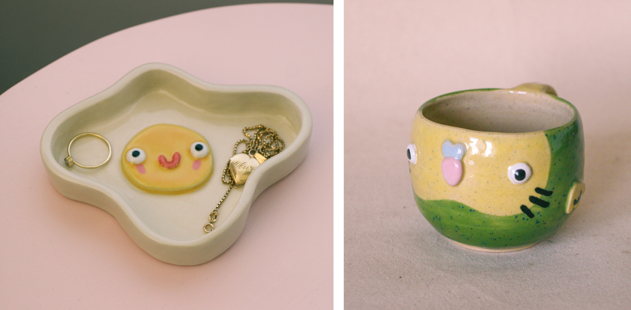
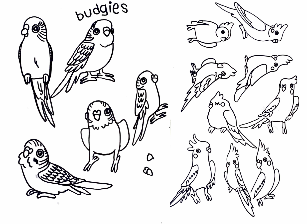
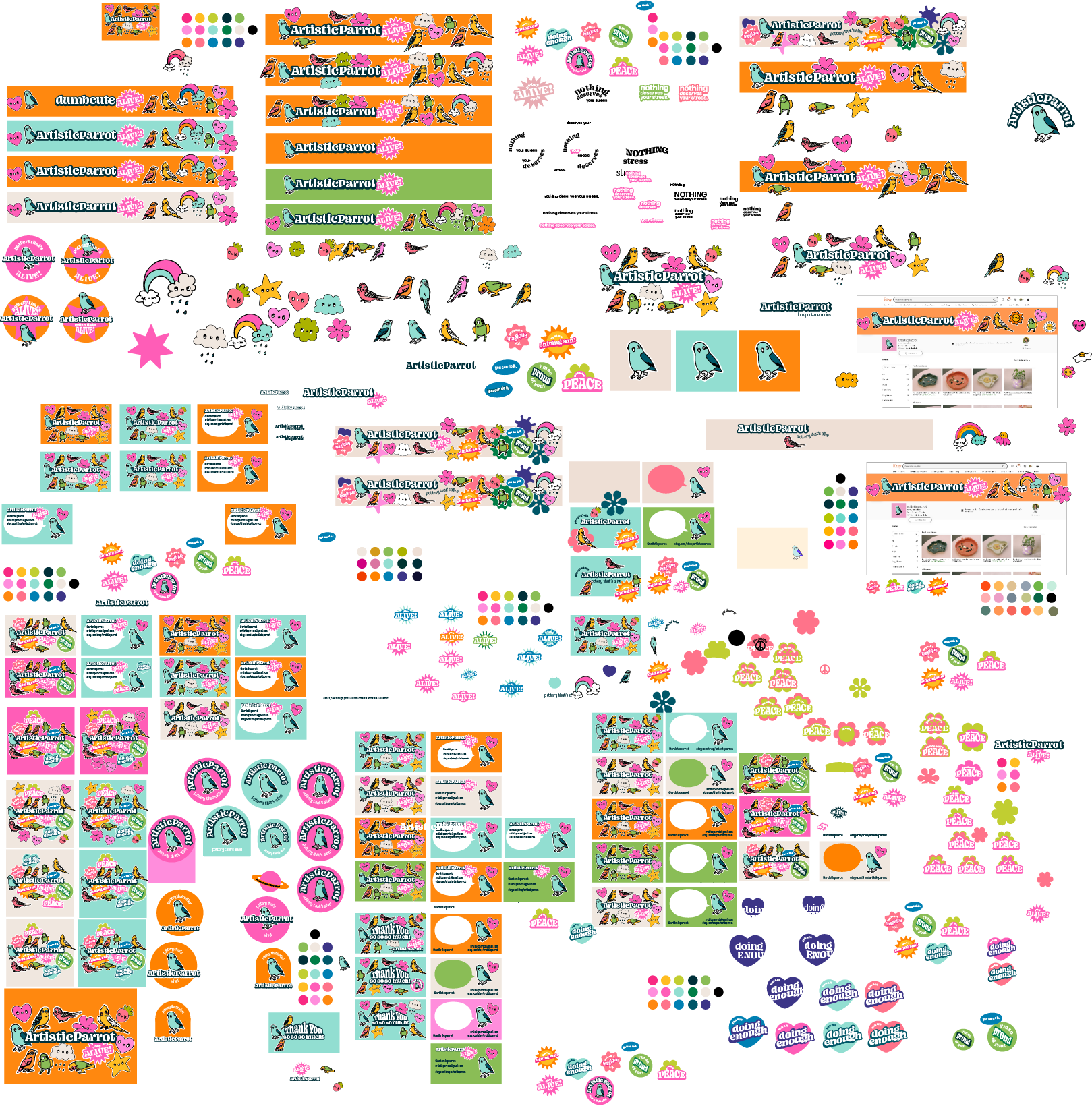
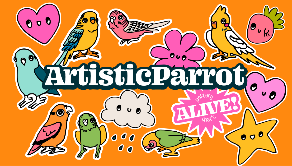
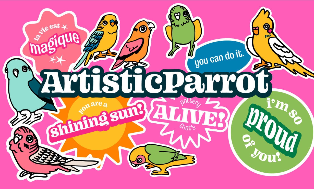
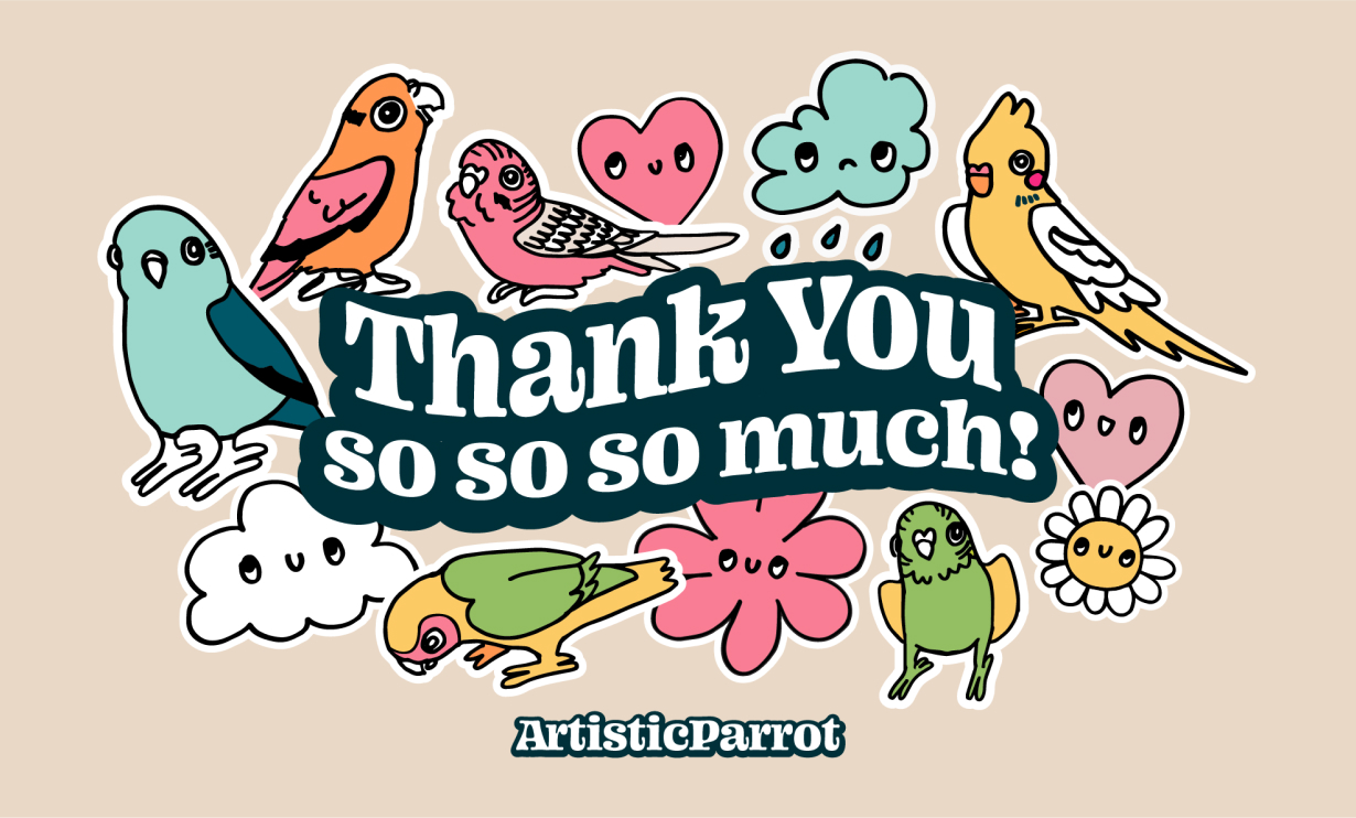
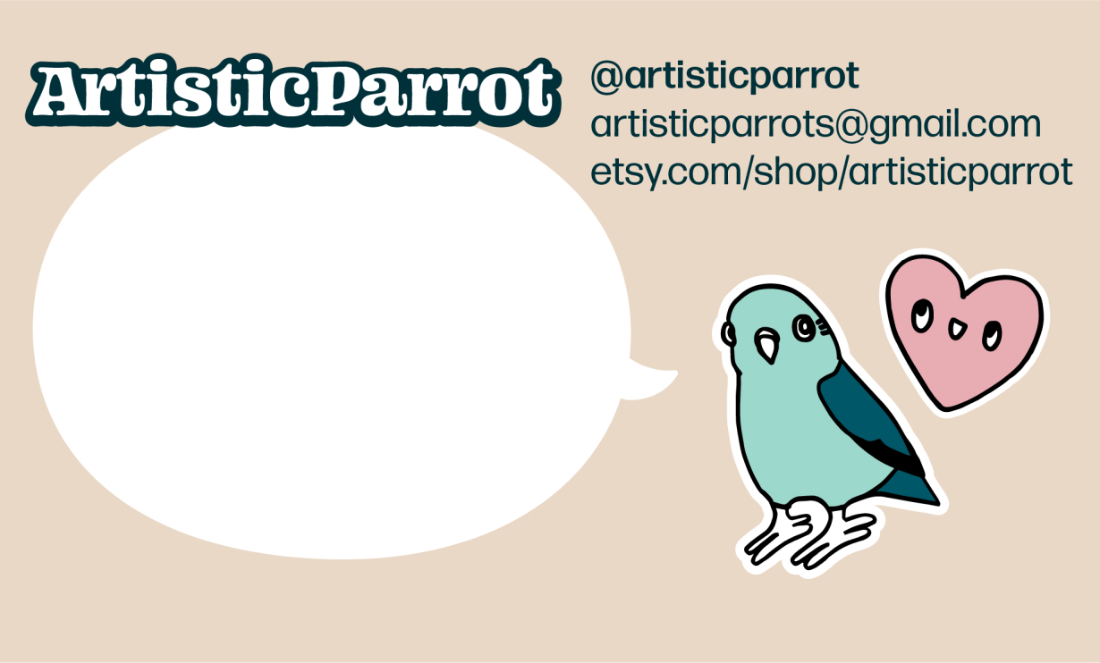
My ceramic work is mainly of personified everyday objects bringing life to the mundane. I created the tagline ‘pottery that’s alive’ to flesh out the brand identity and convey that my work is intended to act as characters in my customers’ lives. I drew simple doodles of birds and characters to convey this world customers are entering when supporting my brand and transformed them into sticker-like graphics. These are reconfigurable and create continuity across web and print and are seen in the final brand identity including a logo, logotype, thank you cards, stickers, postcards, banners and social media graphics.
challenge
A challenge of this project was balancing the childish and fun angle of my work without alienating other audiences. Analysis of my sales states that most of my customers are older than me, so overly young branding was a risk. I remedied this by retaining a sense of maturity through muted colours and negative space, which reflects the aesthetic of my ceramics more accurately as well. In many of my projects, my biggest struggle is restraint as I typically design over-the-top initially and then strip back my work to keep only the strongest elements.
reflection
I learned about the many channels one can use to create a cohesive brand identity in this project. I am proud of the results, but I anticipate the branding will continue to evolve as I grow as an artist. For now, I am satisfied with the branding but I look forward to updating it continually as I improve as a ceramist and designer.
view artisticparrot etsy shop